Redesigning a portfolio builder for Photographers
How it began
Pixpa had sprung out a design agency http://www.ideazinc.com/ and I had joined them in order to work on their design and frontend.
Designing reusable modules
One of the most interesting parts of designing for Pixpa was building the theme framework. Probably that was the part that excited me in the first place to join the company. Building something where most of the elements of design are selected by a DIY tool by the user.
“How do you go about designing something without fixed fonts, colors, images, illustrations or backgrounds?”
Before this the themes were very specific to their configurations and layouts, but this time we wanted to make reusable modules ( both in design and code ) which would allow the user complete flexibility of mixing and matching things. Sure it would lead to some users messing it up, but the possibilities that we give the creative users because of these open up doors to combinations that even we could not have have thought of.
Take a look at the themes ---> https://www.pixpa.com/themes ( It might have changed a lot over the years - but the core idea of components still remains )
COLLECTIONS
A way to showcase various galleries based on categories, locations, client etc. This usually formed the first step in most of the clients’ portfolio websites.
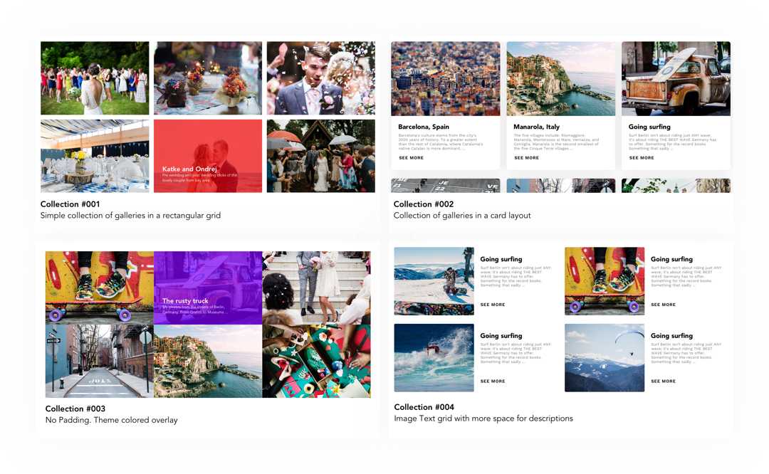
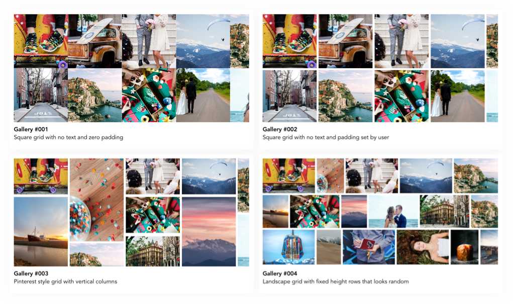
GALLERIES
Galleries form a very crucial part of the websites created through Pixpa. So we tried and incorporate different layouts for different kind of photos and orientations, and made it possible for multiple galleries with different layouts to coexist.
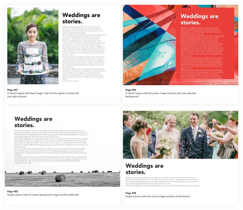
PAGES
Our users create pages for talking about themselves, their payments, their projects, experiences, contact forms and multiple options. While studying all the feature requests, and the pages created by our customers so far - we figured they are usually the combination of 4 main elements :
- Photos ( Cover, background, 2 column etc )
- Title and text
- Form ( For payments, contact us, request quotation etc )
- PayPal payment links
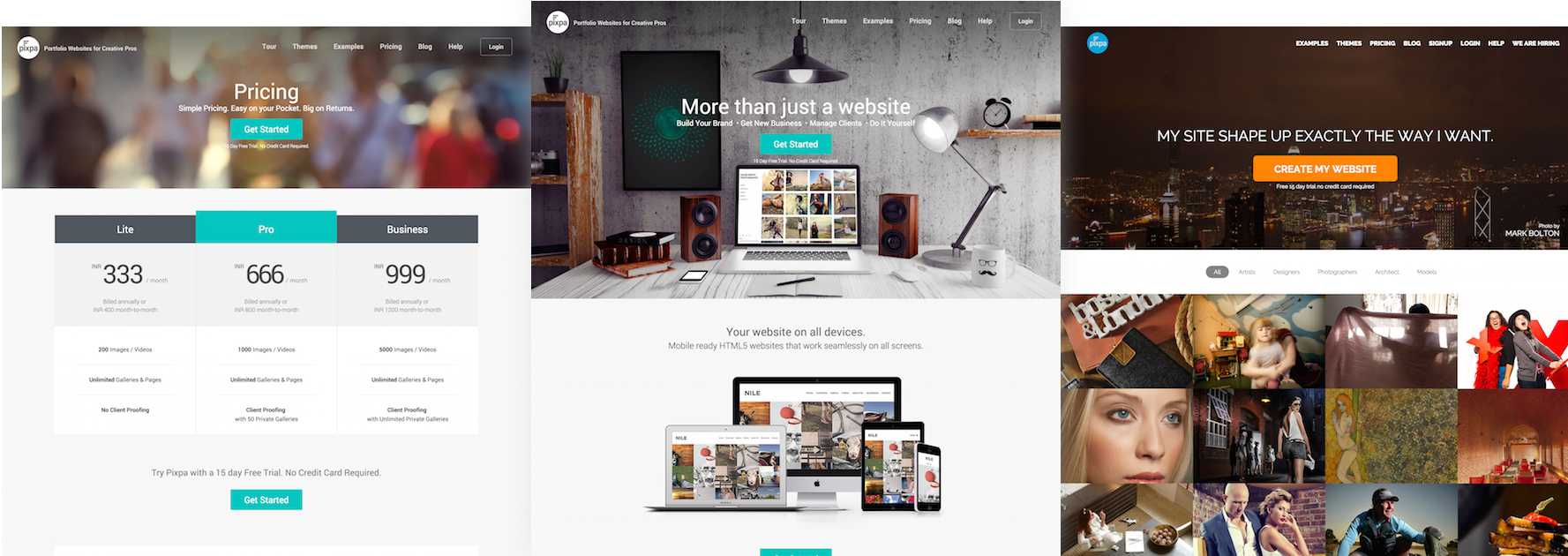
MARKETING WEBSITE
While the new themes were being developed, on parallel we also started working on the redesign of the website to make it convert more and also be able to showcase the dynamic nature of our themes.
Another thing we focussed on our website was to showcase more and more of our clients and their stories
We renamed our pricing plans, made it more clear to illustrate the difference and make it easier for our visitors to understand the pricing structure and introduce live chat to help visitors with any query for the same
The design process
On starting there was a huge list of bugs in the existing website and user dashboard. The tool itself had not had any changes made to the themes in the past 6 months & the number of users had more or less become stagnant
The first step in terms of providing a good User Experience was to first fix the support system to make the users happy and heard while we worked on fixing other things.
Support as a feature
Me and my team member @flyankur after discussions came with this analogy that support should be so good that it almost becomes a feature for our clients. Here is how we went about doing it :
- Setup our team
- Created user stories of various situations and the possible conversations
- Documented, ecorded voice memos of these mock conversations and created User Journey cases
- Creating standard replies and templates
- Configured Zendesk with triggers and automations and setting up SLA
- Every person in the team, be it a developer, designer of the founder himself had to speak to a few customers every week.
- Rewrote all support articles with Video walkthroughs and better content architecture
- Redesigned our support centre making it easier to navigate through them and embedded it in our Dashboard.
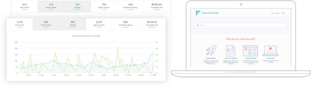
We moved up our satisfaction ratings, reduced the average response time and were able to handle more tickets than we used to. Although we still were pretty behind in our average response time because of the timezone difference
Connected UX
“When you speak to customers - you develop an emotional empathy which gives everyone in the team a personal connect as to whom they are working for”
I was heavily inspired by the Mailchimp’s UX team, and had been following them for a long time. One of the things that Aaron discusses in the above video connected UX.
User Experience is not just for the designers. This made us create a process where anyone ( support team, the feedback polls, the billing department, social media comments ) who would get an important feedback ( negative or positive ) would forward it to a tumblr blog so that we have a growing and searchable archive of what our users’ feel about the product over the time.

Also in our daily standups - it would be fun going through some of these posts and got everyone in the team at the same place
Hope you liked going throught the above. :)