Rebrand Cube26 - An innovation hub
Cube26 wanted to revamp their existing website to showcase the new technologies they had been working on, work up on majour launches and to start hiring a new team.
Cube26 has developed the next generation of technology that allows devices to recognize users, interpret human gestures and understand their emotions. Cube26 software solutions are scalable across various platforms including mobile phone, tablets, PC and SmartTV.
Cube26 aims in creating a smarter and simplified world where people and devices interact with each other. These are integrated in a way that minimal effort is made on the part of the user.
Simple, Credbile and Energetic
When I first met the team at cube26, we discussed a lot about making the website according to the marketing needs of the team. On knowing more about their current products, partners, the things they are about to launch and the upcoming reasearch, I decided them to create a content audit and come up with the content inventory that they wish to show
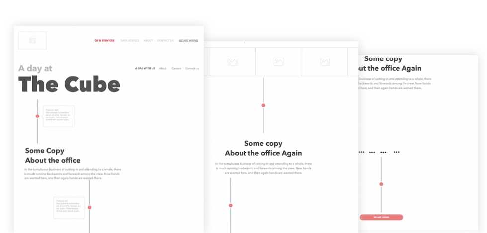
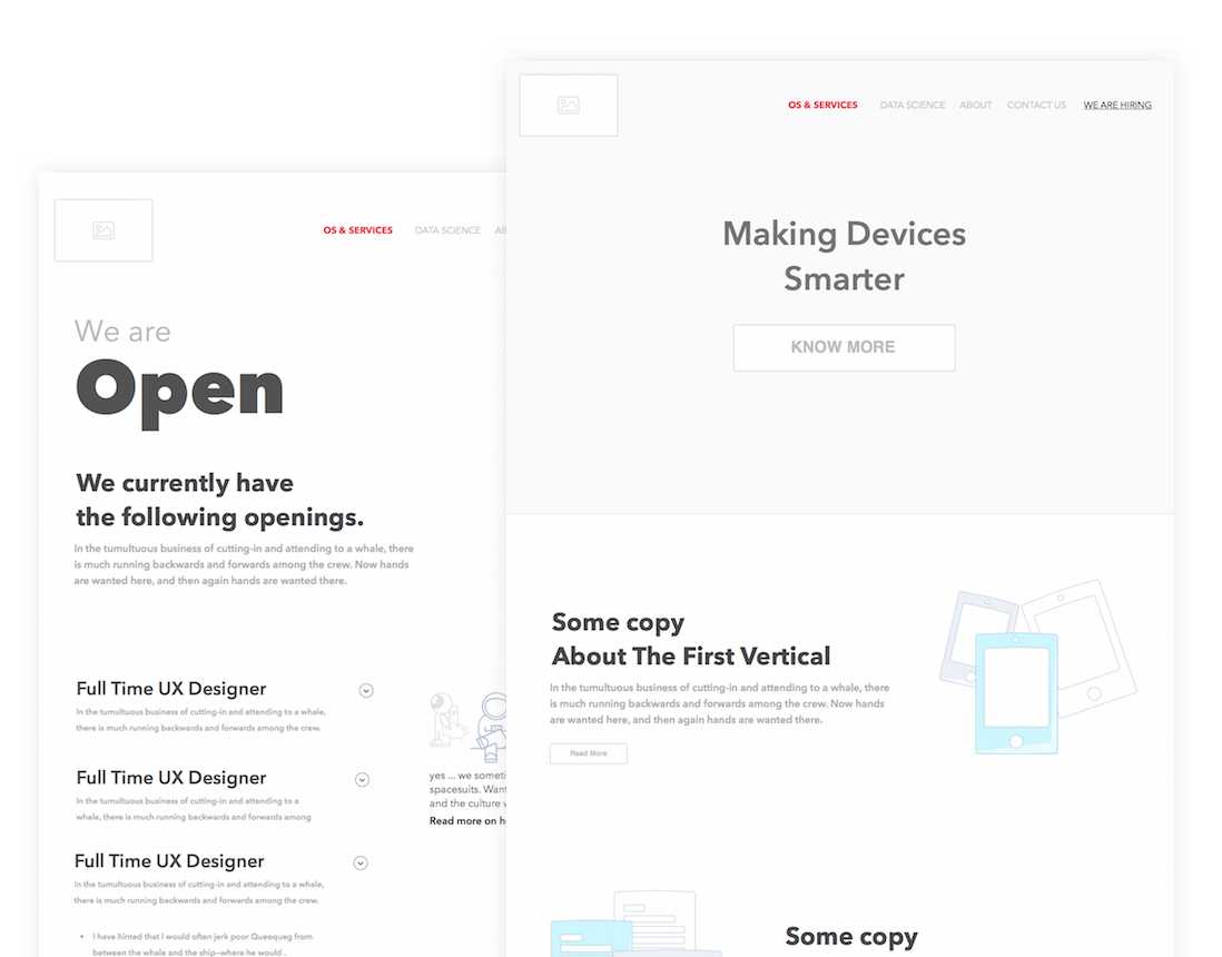
The initial wireframes
I talked with team members and founders of the company to get to know more about the team culture. Since the website in a way puts the identity of the team out, it should also incorporate those characteristics.
The final designs
After many iterations with the team and the founders - here is what we had going on in the end. Take a look at the live version yourself - http://cube26.com/


