We had a small team of designers, illustrators and content writers at InstaOffice. Also we were working with a bunch of freelancers as well as interns. Over a frist few bad experiences, we realised that we need a system to keep things consistent across these individuals and to scale our brand messaging to various mediums. Here I would be discussing some of the learniings from these experiences.
Some of the things discussed here are not really a part of interface or graphic design, but they sure are a part of the design efforts and the end part of user experience.
Voice and Tone guide
Before we even started working on the website, apps or any other digital aspect of our design, me and my cofounder Vikas sat down together to define the voice and tone that our brand would have.
“Our voice is human. It’s familiar, friendly, and straightforward. Our priority is explaining our products and helping our users get their work done. We want to assist our guests, both in our offices and in our virtual properties, people without patronising or confusing them.”
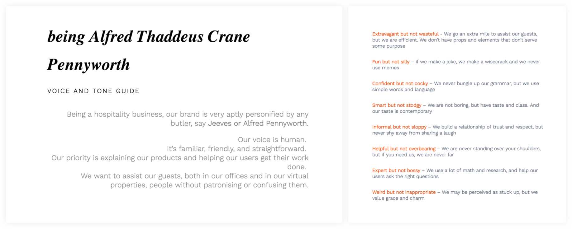
Treat your brand as an animated cartoon character
It’s easier to imagine your brand being this cartoon animated character, and then asking yourself - “Is this how he would write an email?”, “Is this something he would like ?”, “How would she react to this situation?” and it would help you in keeping your branding and messaging consistent.
At InstaOffice, we always referred our personality as the one of Alfred in Batman movies. And you would often find the team saying - But Alfred would never crack such a joke, that’s not how Alfred speaks. As the team grows, it became easier to scale this feeling across the team.
User Experience is everyone’s job.
A good user experience extends across different teams and verticals. It’s the combined effort of all the mediums and touchpoints a client has that dictates his experience. I have written about this point even more in details. You can read my article on Scaling UX across the product.
Showing happiness, and not just saying it
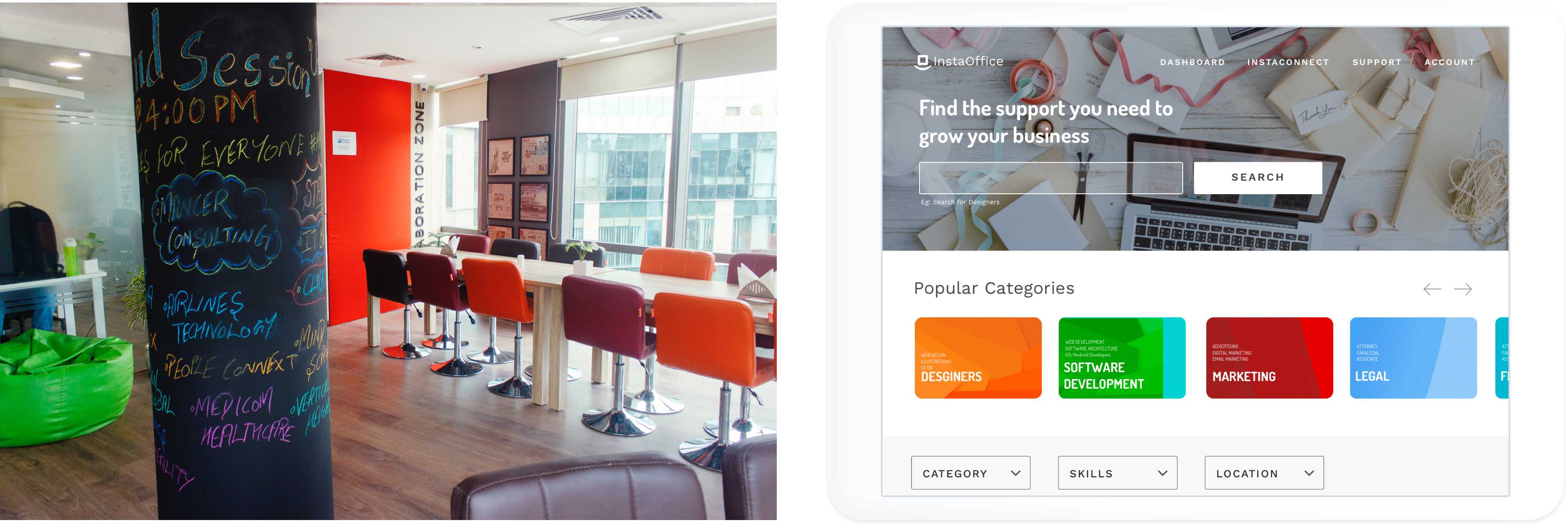
Very early in the stage of spreading the happy offices tag line, we decided to focus on photos and videos to carry forward our messaging. ==In our design efforts, we would try and use real photos over illustrations and stock photos where ever we could.==
So across all our designs - Web, mobile, offline, social media, print graphics - We used as many real photos and videos as much as we could.
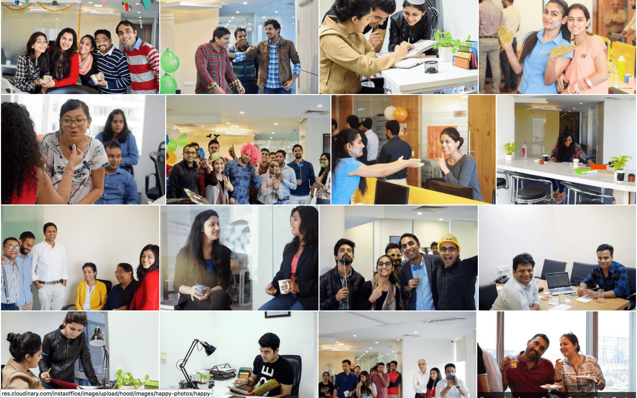
Our videos also had the music and the moments that conveyed a collaborative happy place to work in many videos that showed the energy and community in our spaces.
It’s not customers or a group - it’s a community
As a brand your biggest achievement could be if your customers start associating themselves with other customers - and call themselves a community. And building a community is a tricky job - you can’t be too protective yet you have to let it flourish.
We organized regular events, both for our members and outside people - We call them the unwind sessions Our events are an integral part of the InstaOffice experience. They are a chance for our members to learn, speak, network, get inspired and get reinvigorated for the challenging road ahead.
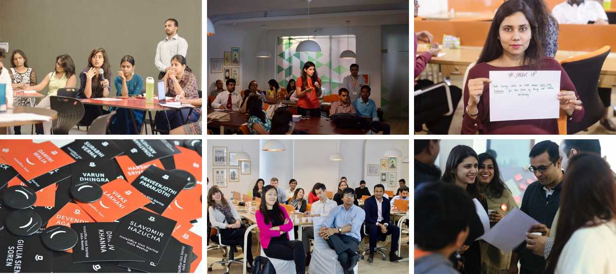
Further extending this, we took the experience of collaboration on a digital platform which we called as The Grid. It allows our members to to communicate with each other as well as outside consultants, mentors and investors.
Also we extended this experience in each of our spaces by having collaborative spaces enabling offline collaboration similar in nature as the online one.
Stories, stories and more stories
People love reading stories. It makes them relate to the people in the stories and believe in the brand. Moreover sitting in collaborative spaces, people feel more connected to other fellow members.
At InstaOffice, we took an effort of sharing stories of our members - what they do, about their teams and how is their experience in the workplace.
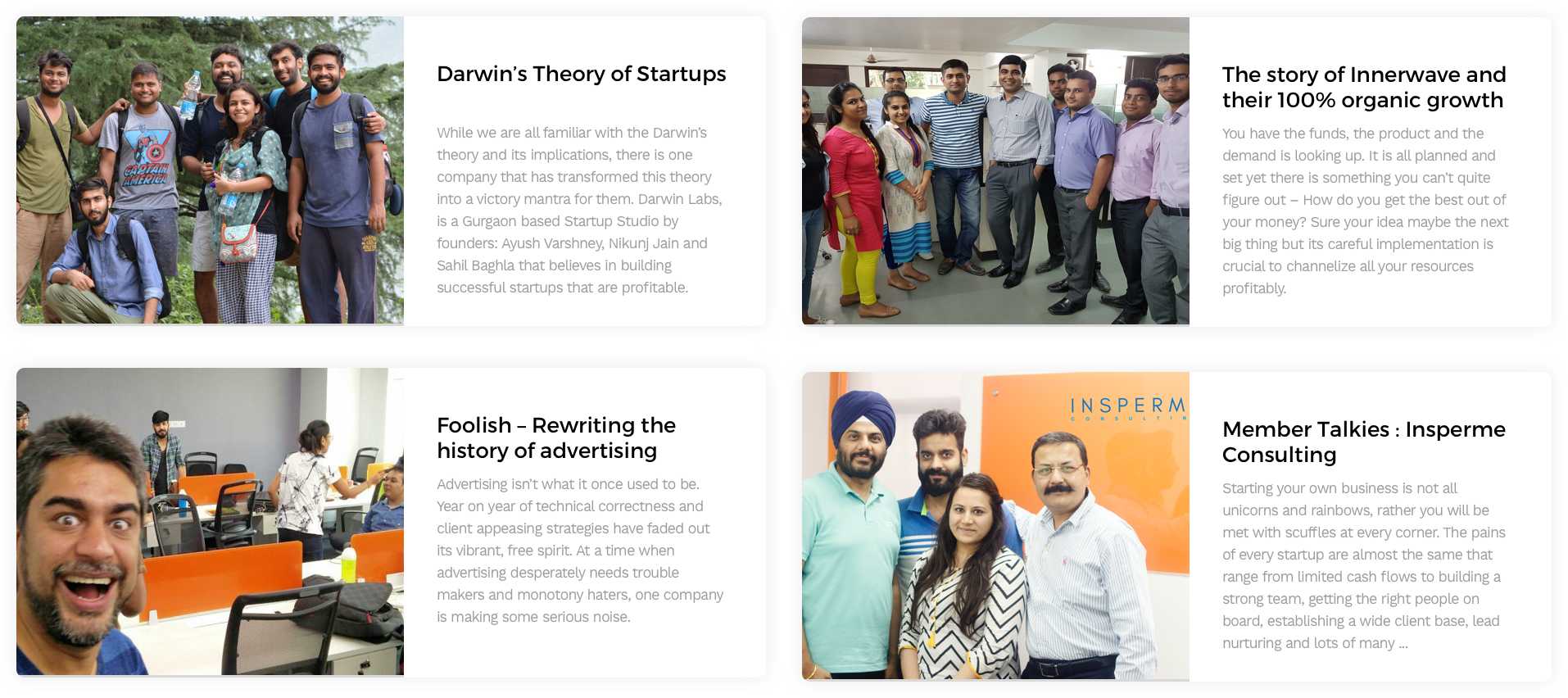
More than the fact of creating stories - we put stories in most of our designs and communications - Be it our printed newspapers, our onboarding playbooks, the sales and investor decks, the newsletters or mailers
the process behind it …
By learning from different people, and to make the design consistent across different team members - we maintained a few principles that enabled us.
Content first design
All the designs started with first making a note of all the content that would be included in the design and than properly ranking them on a few parameters like conversion, brand value, use to the customer etc. The variables were different across different projects, but the act of putting the content and rating to it did not.
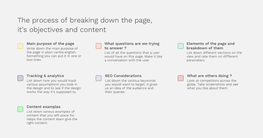
Take a look at a template we made for redesigning the property page at InstaOffice.
Don’t try and decorate
We tried to reason with every color, every background and every design choice we took in our team. Some of them did come out of our gut or general likeness, but most of them had to have a reason.
eg: Using a hero image on a property page - There has to be a reason for it rather than just making it look good
Focus on Typography
We had a very core focus on typography. From using limited fonts, to having a modular grid system based on the golden ration in our websites - typography played an important role in all our designs.
We kept our typography bold, Huge in some cases and not compromising on readability. ==In fact a lot of times, for the new interns and designers - we made them design first using just type, without any colors, images and make it pretty.==
Communication has to be asynchronous
A major part of a good team to work is to have a really good communication with other people in the team. Zach Holman from GitHub wrote about how their communication is asynchronous and it has stuck with me ever since.
Our communication was simple : No design has to be started till the brief is clear and agreed upon. If it happened verbally or on whatsapp - it didn’t happen at all Use slack for everything. Meetings are only for brainstorming. Designs have to be iterated and approved on Marvel. Developers get the designs in Zeplin along with comments for various interactions. All doubts to be cleared in comments over the same. No designs have to be shared as attachments over emails or slack. Use Google drive or other services for sharing files. One common shared repository of all design assets in Google drive. Use data where ever possible in communication If you use data - make sure you share the source of it ( Different data can be interpreted differently by different people )
I am still in the process of completing the above post, but I would love to hear as to how you approach the problem of building a design culture in your organization. Do share your thoughts at drecodeam[at]gmail[dot]com