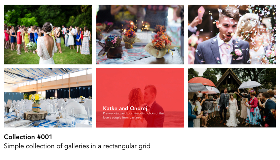
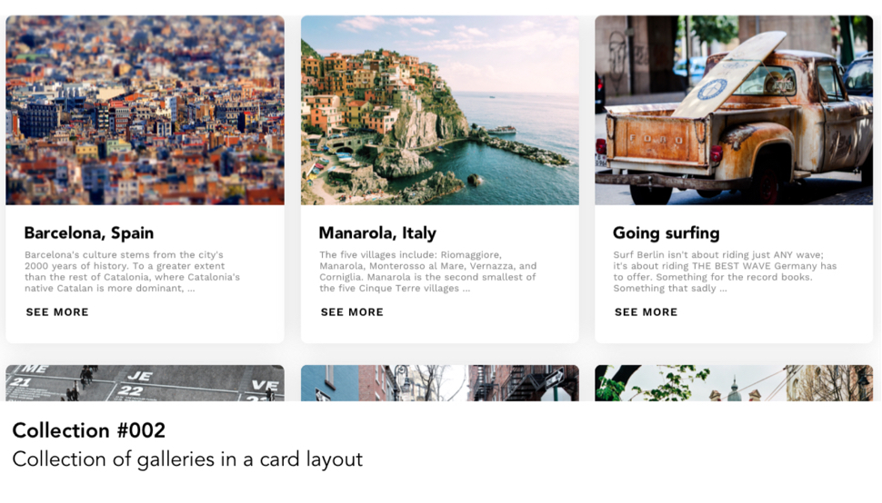
Collections
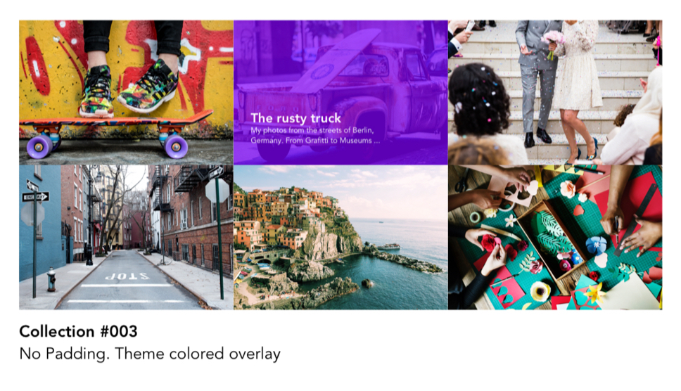
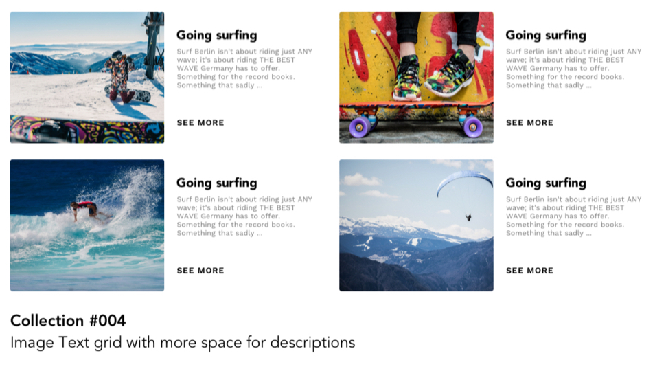
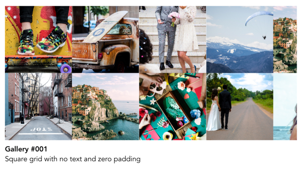
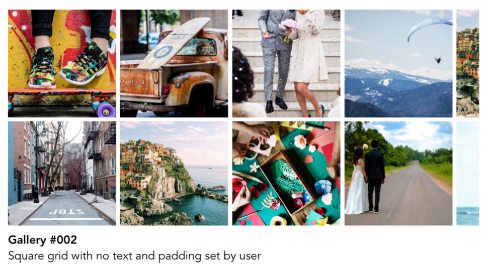
Collections was a combination of galleries and pages. It gave the user flexibility to arrange his work by theme, location, category etc
One of the most interesting parts of designing for Pixpa was building the theme framework. Probably that was the part that excited me in the first place to join the company. Building something where most of the elements of design are selected by a DIY tool by the user. Designing something without fixed fonts, colors, images, illustrations or backgrounds
Before this the themes were very specific to their configurations and layouts, but this time we wanted to make reusable modules ( both in design and code ) which would allow the user complete flexibility to mix and match things.
Collections was a combination of galleries and pages. It gave the user flexibility to arrange his work by theme, location, category etc
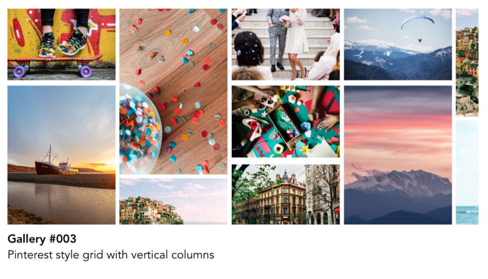
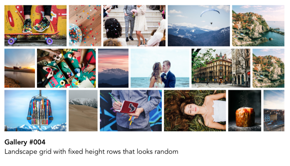
Galleries form a very crucual part the portfolio for Photographers. So we tried and incorporate different layouts for different kind of photos and orientations, and made it possible for multiple galleries with different layouts to coexist.
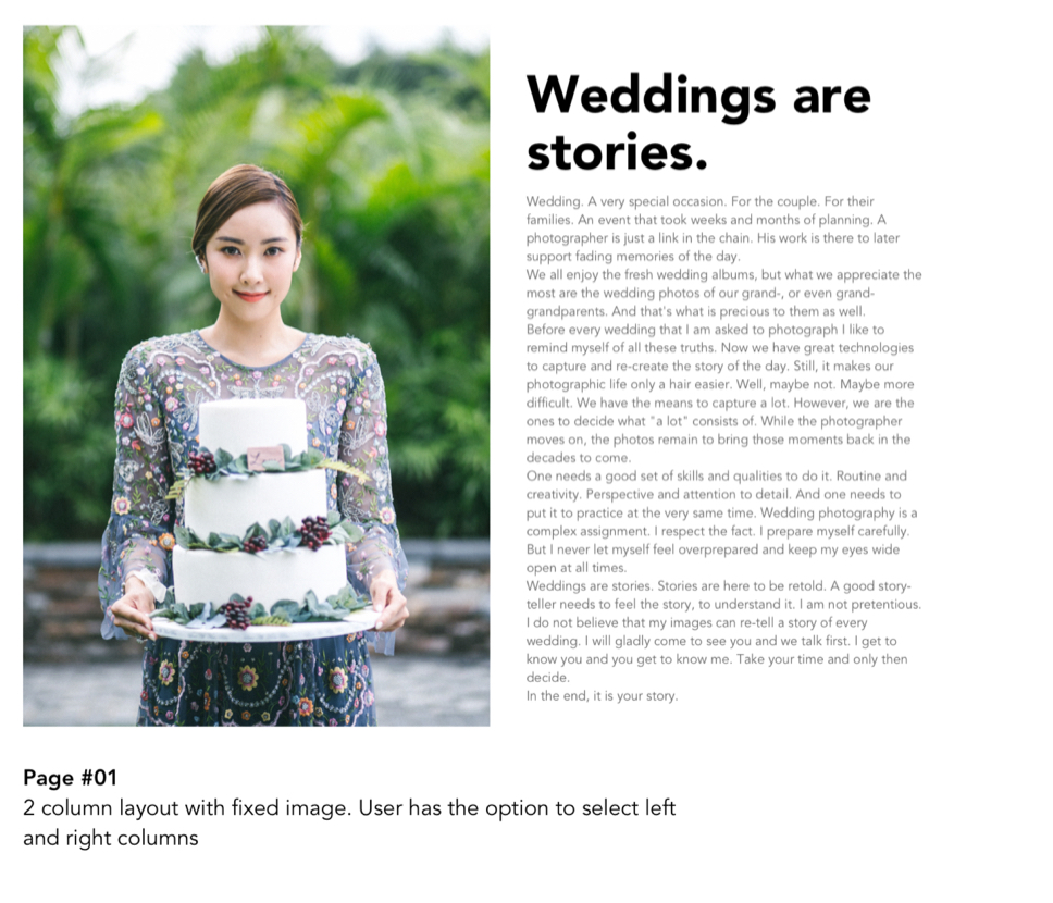
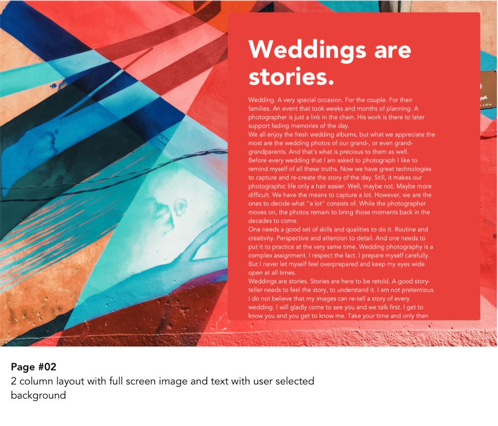
Our users create pages for talking about themselves, their payments, their projects, experiences, contact forms and multiple options. While studying all the feature requests, and the pages created by our customers so far - we figured they are usually the combination of 4 main elements :
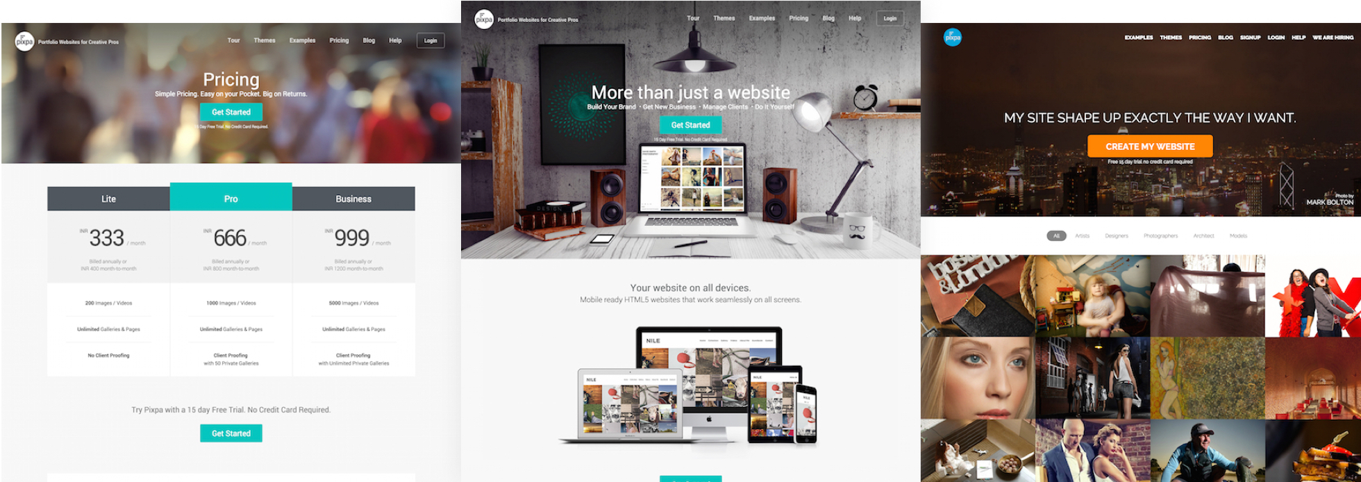
While the new themes were being developed, on parallel we also started working on the redesign of the website to make it convert more and also be able to showcase the dynamic nature of our themes. Another thing we focussed on our website was to showcase more and more of our clients and their stories Interestingly we also renamed our pricing plans and made pricing more clear to illustrate the difference and make it easier for our visitors to understand the pricing structure. Another major thing that helped in conversion n pricing page was live chat.
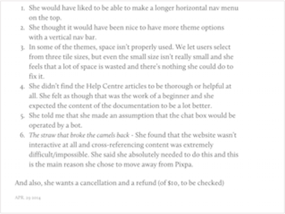
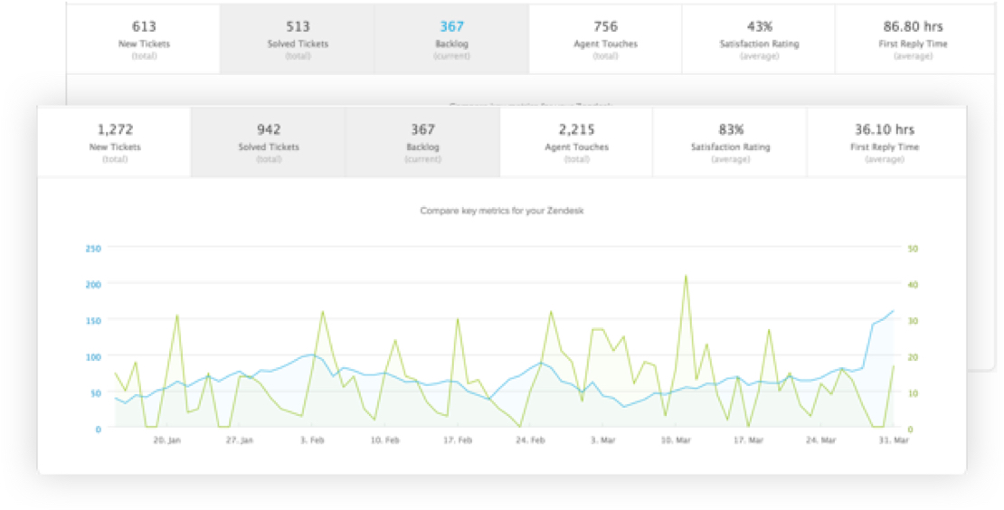
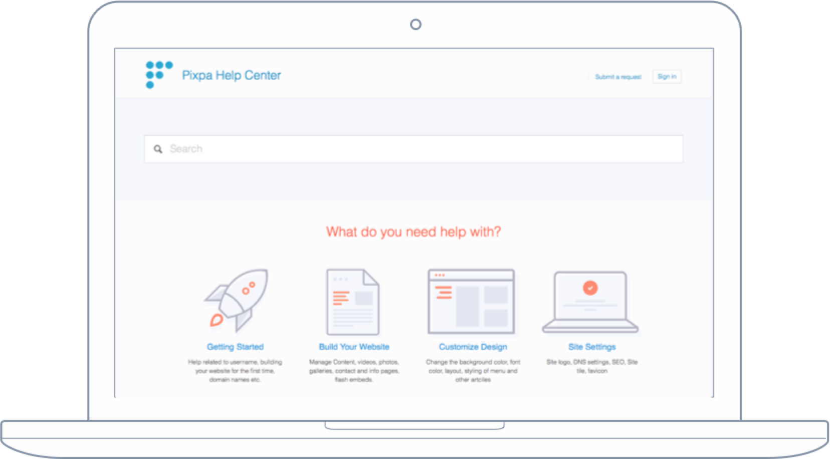
On starting there was a huge list of bugs in the existing tool, along with the existing team already on their notice period. The tool itself had not had any changes made to the design of themes in the past 6 months or maybe more, and the needle of number of users hadn’t moved in any direction for a while. The first step in terms of providing a good User Experience was to first fix the support system to make the users happy and heard while we worked on fixing other things.
Me and my team member @flyankur after discussions came with this analogy that support should be so good that it almost becomes a feature for our clients. So we setup our team, got everything setup on Zendesk, wrote down the replies, recorded calls and spoke to our customers. We created user stories of various situations and the possible conversations. These would act as an outline for the support individuals to talk to our customers.
Next we redesigned our help centre and tried to reduce the need for support altogether
We scaled from being a 3 person team to 8 people and 5 interns in the next 3 months. While we were working on a lot things simultaneously, it was becoming increasingly difficult to churn out a consistent design. I was heavily inspired by the Mailchimp’s UX team, and had been following them for a long time. One of the things that Aaron discusses is about connected UX and we implemented that in our own design team, though not with Evernote, but we did so with a tumblr blog.