Enabling developers to build location based applications
HyperTrack | Product Designer | 2018-19

At HyperTrack, we enable developers to build applications that use location or device activity. I worked as a solo designer responsible for everything in design and some parts of UI engineering.

1
UI Components

Our core offerrings was our customisable UI components. These components came as mobile SDK or widgets, available on multiple platforms and could be consumed through multiple mediums.

These components were available on Android, iOS, React Native and Web.

1.1
Trips

Real-time tracking of an individual with ETA, route, and delays. Along with this we show device status, battery, speed, permissions and connectivity status.

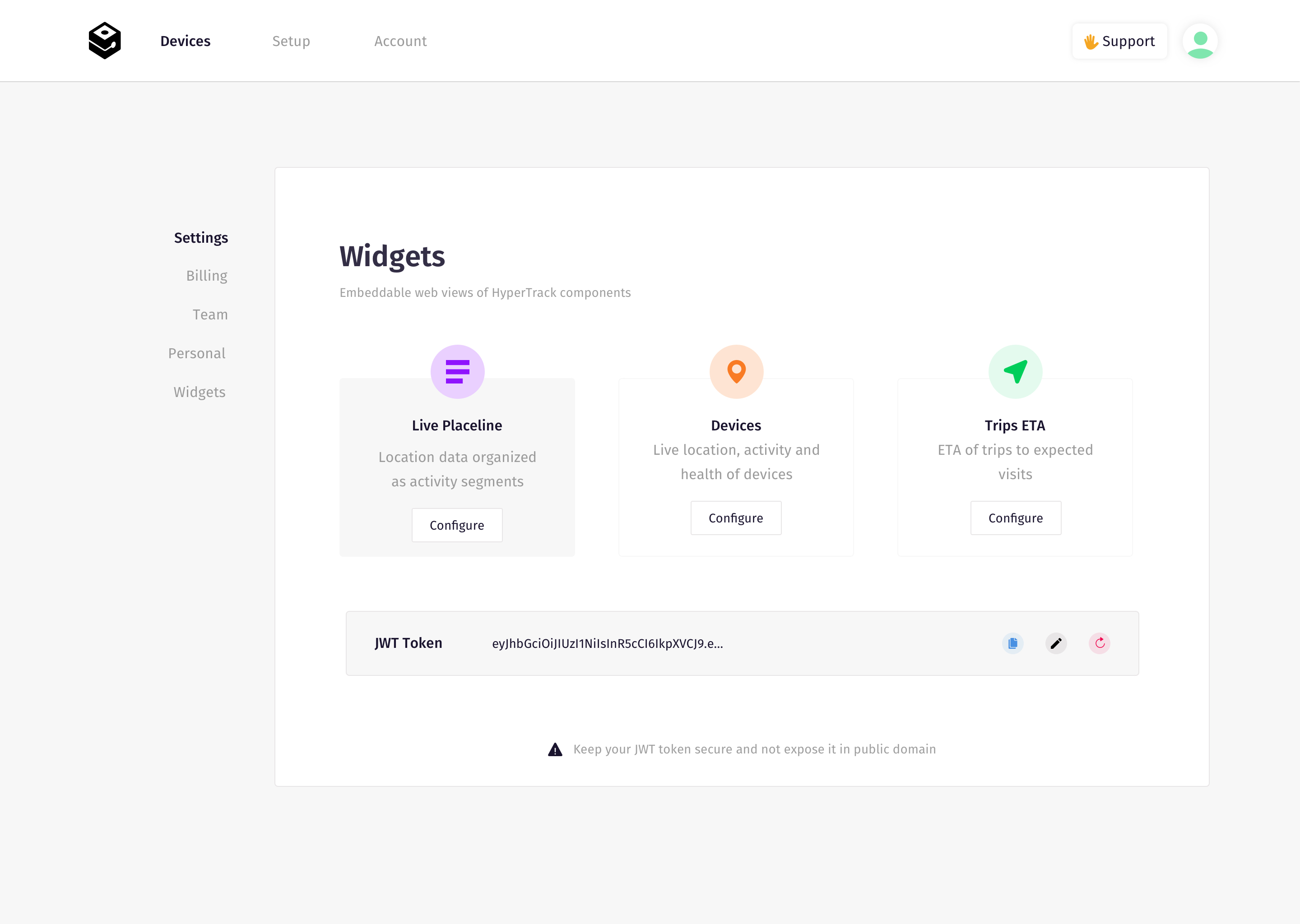
Available as components for iOS, Android, React Native and as Widgets for Web. Methods also allowed for customisation of colors, metadata, icons and typography.

Map prototypes require an interactable map to get all the interactions right. I used Framer and Mapbox to construct my prototypes. I have written about the whole process of using Mapbox, Framer and realtime data together.

▶︎ Prototyping experiences with live location data

1.2
Live location

While Trips was to visualise an intended movemement with business context, Live location was to see a single or multiple users on the map at a given time.

1.3
Placeline™️

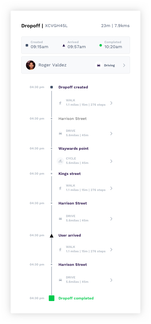
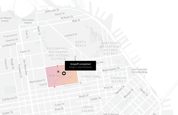
Placeline helped visualise an individual's story - places visited, routes taken, business checkins( eg: Pickup, Dropoff, Visit etc ) and device status. It's like a contextual timeline of what all the person did in a day.

Visual showing HyperTrack placeline
Visual showing HyperTrack placeline map
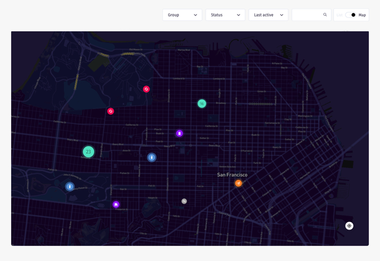
Visual showing HyperTrack view of all devices
1.4
Structuring components like Lego blocks

We built these components to be like lego blocks that devs can use in any way to build their idea.

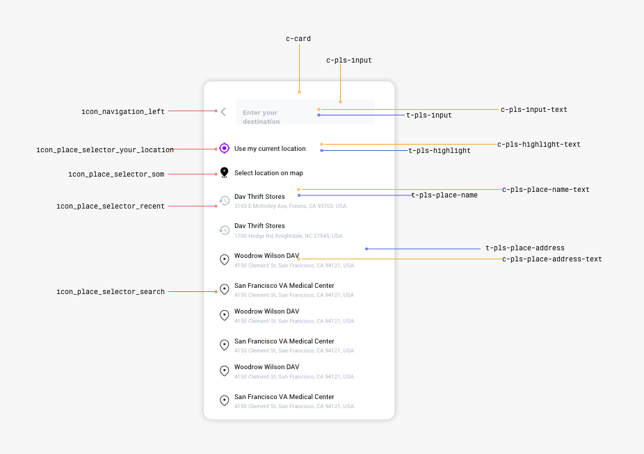
Products want to provide same experience across these platforms. This meant that our components also had to be similar in their features, customisation options and usage across these platforms. We also wanted to keep the methods to change these properties similar in different platforms. Hence we worked on documenting our designs with variables which all platforms would use

HyperTrack SDK component documentation
2
Dashboard

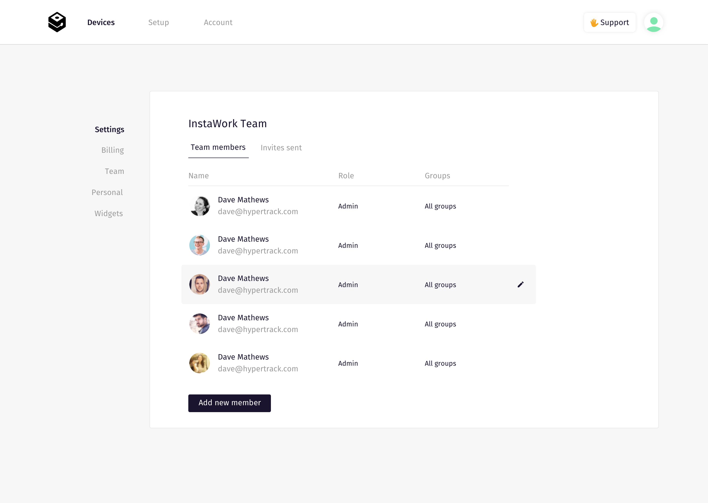
Our dashboard helps our users get visibility on the workforce and their productivity. Customers could see their entire workforce in real time, track a single individual, replay someone's daily movements, get analaytics and manage their team's access through our dashboard.

We had built the above features based on the components and API's I mentioned in the first section. Internally, we treated dashboard as the first customer of HyperTrack components and API’s.

Hypertrack blank and empty states
2.2
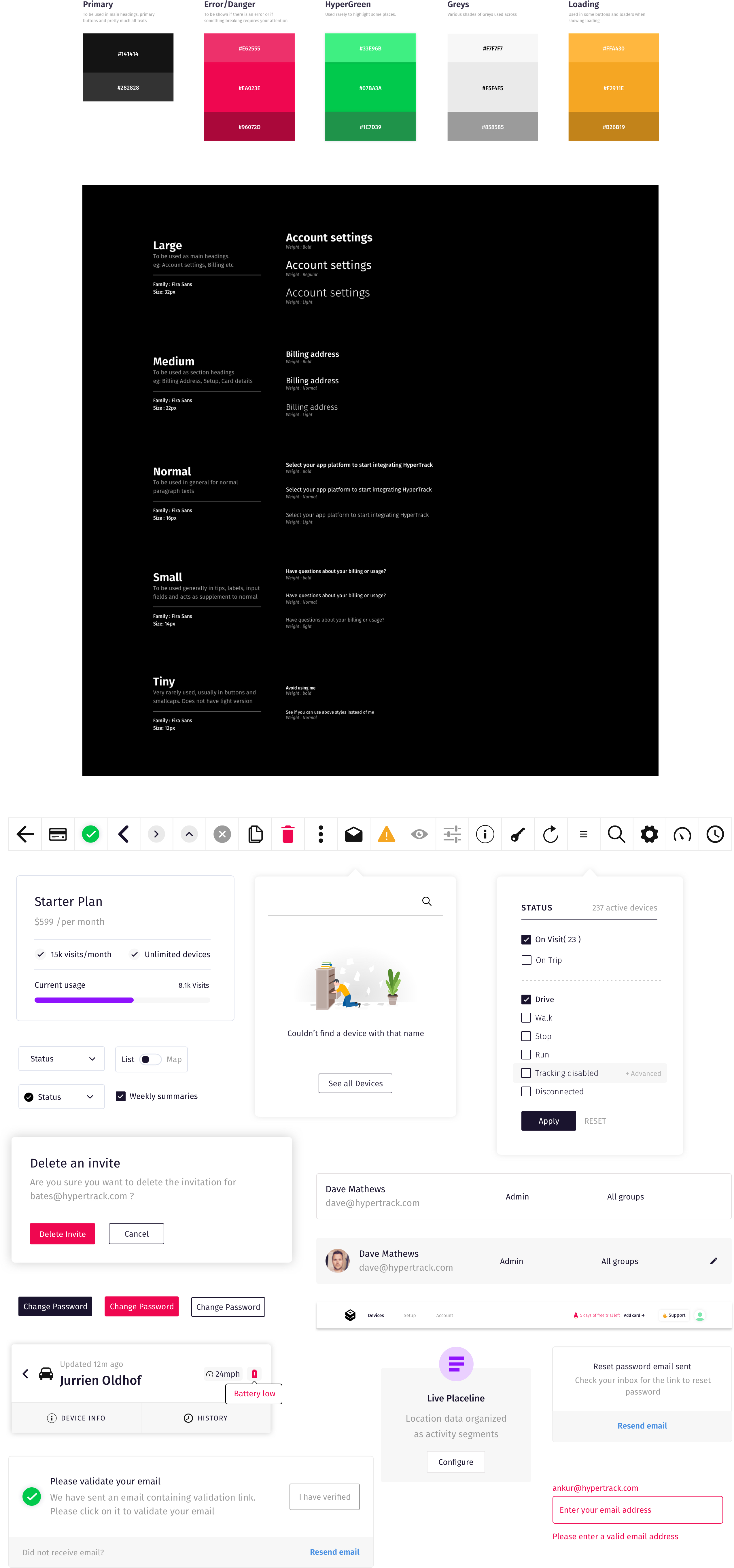
Movement design system

While building the console, we also built our design system called movement. The UI components were coded in React. Read how our system evolved over time and the learnings we had in the process.

Hypertrack blank and empty states
2.3
Bring the chocolate

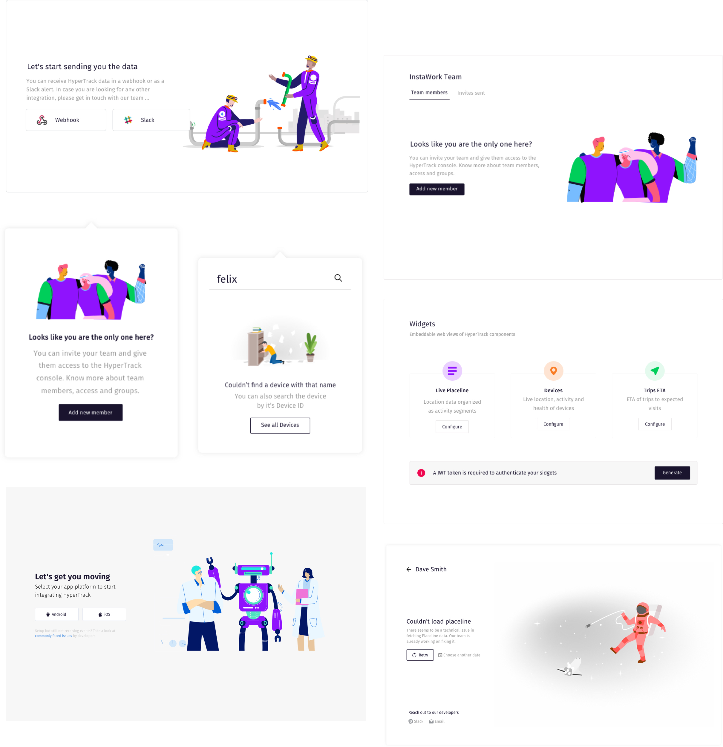
Other than building a consisten visual experience, we also made sure that we are able to delight users. Hence we included special emphasis to microinteractions, blank states and error states throughout our product.

Title inspired by from this article

Hypertrack blank and empty states
3
HyperTrack Live app

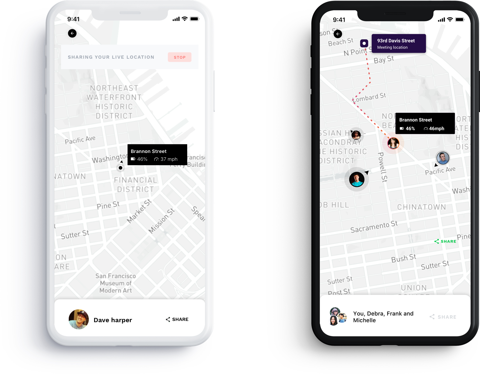
HyperTrack Live App was our consumer app for live location sharing. In order to speed up testing and feedback over our product, we built this app. It would give us a sense of how someone would use our components when building a consumer app, as well as help us give a real time demo of our product

The app enabled you to share you live location and it would generate an unique URL. You can share this with anyone, and they could start seeing your live location. Optionally, they can also share their location in the same URL and it becomes multi person live location sharing in that case

Live apps from HyperTrack
Try out the HyperTrack Live app - ANDROID | iOS
4
HyperTrack Website

During the time I had joined, we were undergoing a brand refresh. I, along with Vibhas, worked on the initial branding guidelines and started working on an internal library of what would become our complete brand in the coming days. Then it was followed by a redesign of the website to showcase of the possibilities of what HyperTrack could be like. I designed as well as coded the website.PS: This is an older version of the website which we changed in Mar 2019. The new website is still a WIP

Visit Website
5
The design process

I worked as a solo designer at HyperTrack, but I focussed a lot on the process that I follow. Processes and documentation help train our intuition as designers as well as keep everyone else in the team on the same page.

5.1
User Research

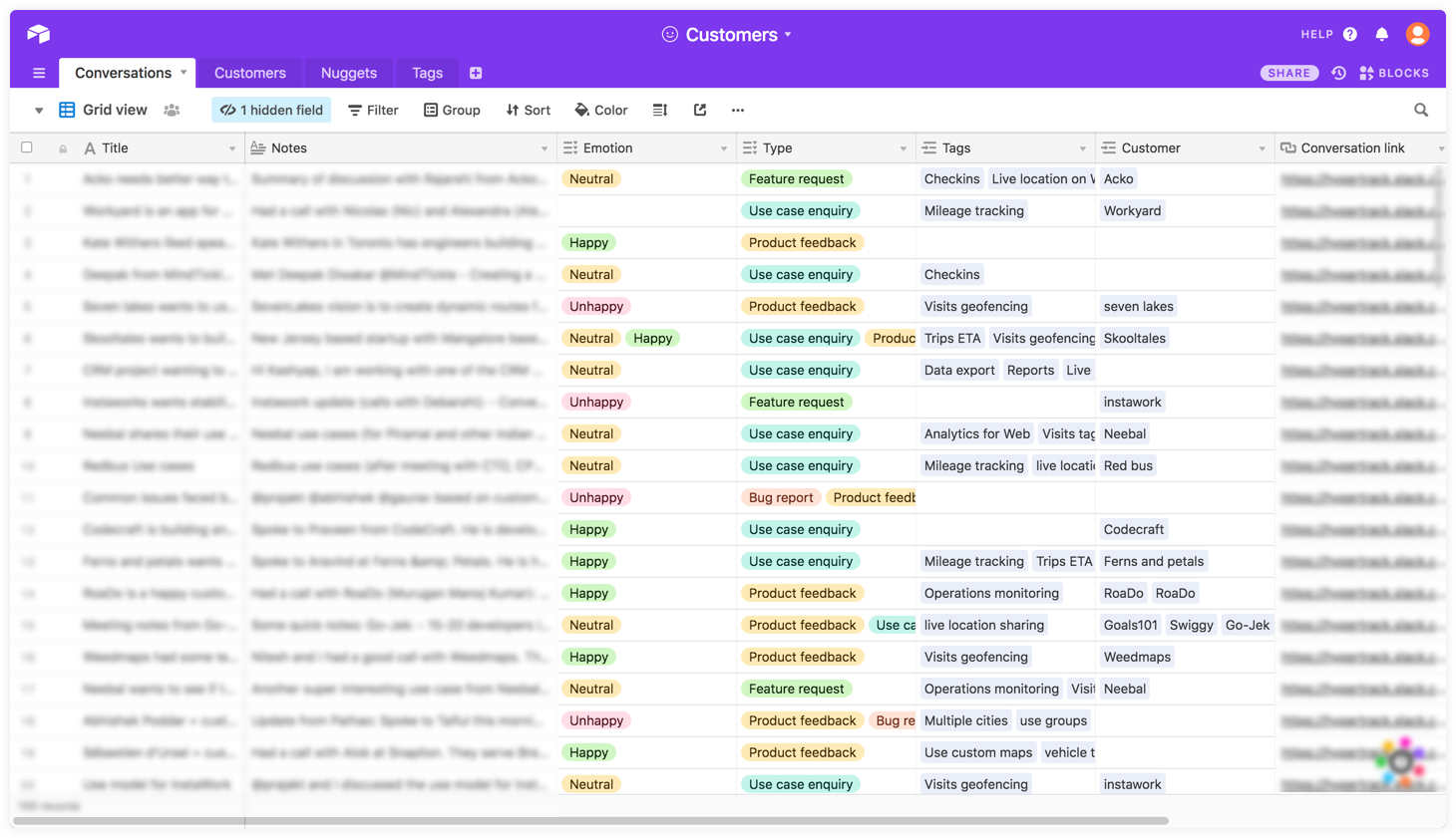
Our customers are developers, who build using our components, and Operations managers, who consume our dashboard to keep track of their workforce. We don't have a dedicated support team and our entire team handles support. Maximum customer conversations happen over our Slack community followed by Email, Phone calls and intercom. All feedback is organized in a single Airtable sheet, where we add tags, nuggets and sentiments onto them.

Hypertrack blank and empty states

When trying out new designs, I would generally reach out to people who would have mentioned similar things from this sheet. Share interactive prototypes with them and have a video call to get their feedback

5.3
Copy organisation

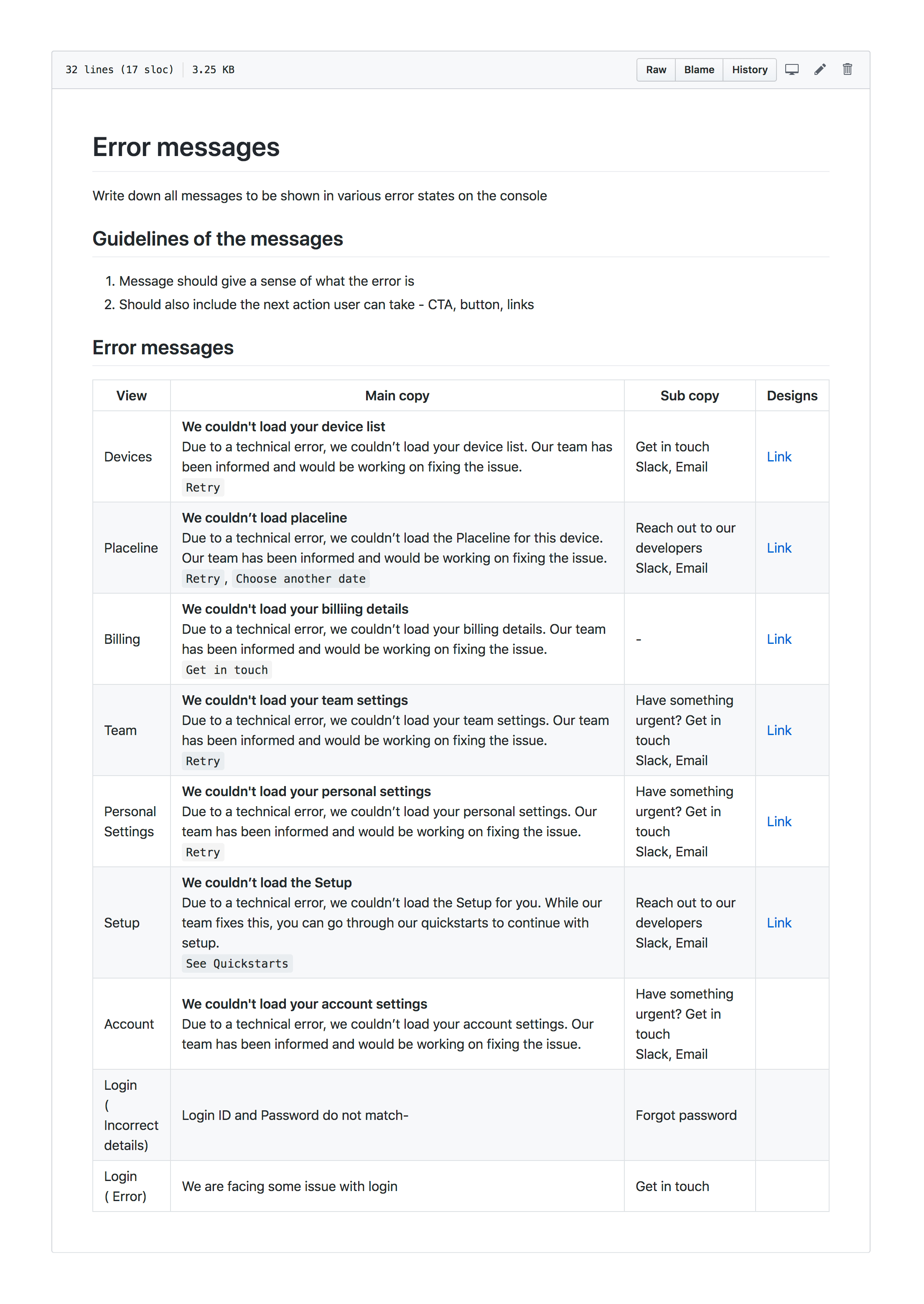
We being a developer company, GitHub is the default tool used for all collaboration. I have organised all our copy into a single GitHub repo and all changes go through the same repo via PR’s. It’s organised by microcopy, error messages, blank states, Website content, Product glossary etc

Hypertrack blank and empty states
5.4
Collaboration

Getting your entire team - developers, product managers, content etc on the same page plays a key role in shipping a good final product. At HyperTrack, we worked on improving our product experience and also ship faster. I have written about this in detail.

▶︎ Design systems for a solo designer

6
The team behind this

At HyperTrack, we were a design team of 2 for a few months and then I was the solo designer for the rest of the journey

Ankur Anand
Me
( Designer )
Vibhas Jain
Vibhas Jain
( Designer )
Abhishek Poddar
Abhishek Poddar
( Product )